
SNICKET is a digital exhibition platform. We help curators, creators, and anyone with a history to tell their stories.
-

Introduction
-

The Arrival of Picture Politics

-


The Workers Burden, 1910
-
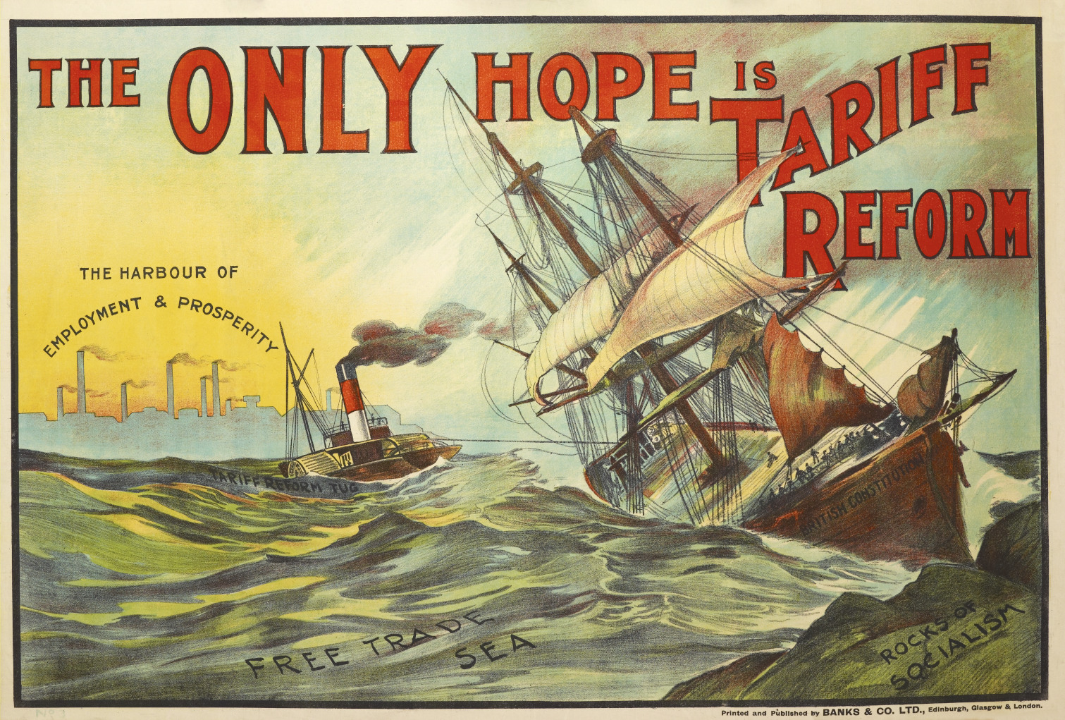
The Only Hope is Tariff Reform
-
-
The Poster Elections of 1910
-
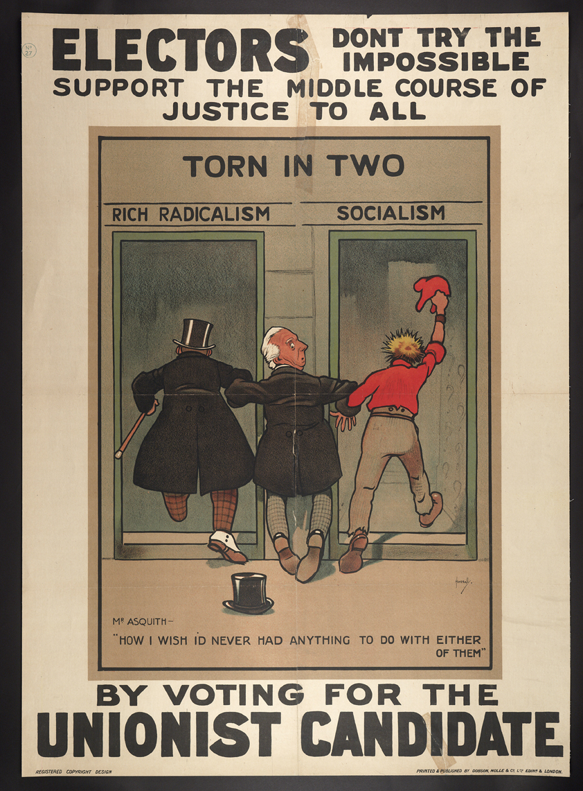
Don't Try the Impossible
-
The Glutton
-
Our Old Nobility, 1910
-
Baiting the ‘Dear Food’ Hook
-
Mothers Vote Labour
-
-
New voters
-
Labour Stands For All Who Work
-
Men and Women Workers, Your Chance at Last
-
THE NEW VOTER
-
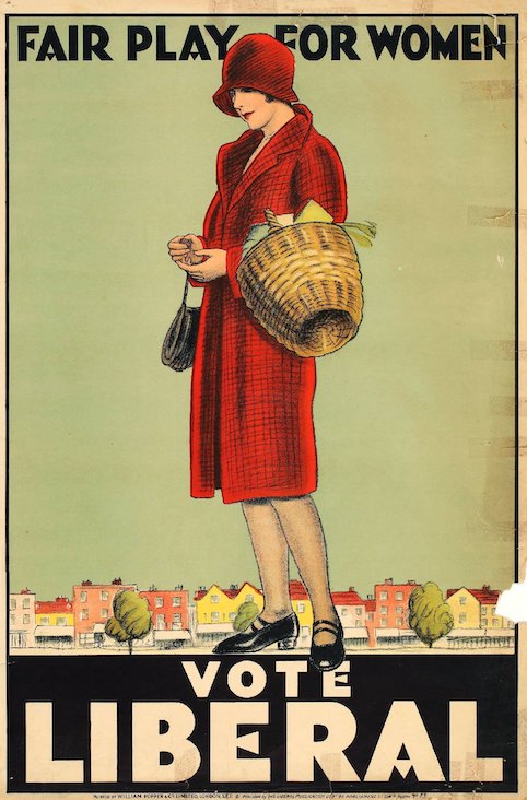
Fair Play For Women
-
-
Presidential Politics
-
Safety First
-
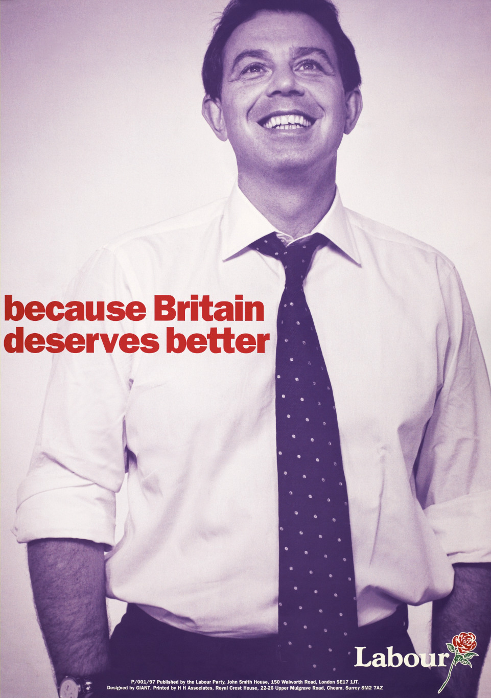
Because Britain Deserves Better
-
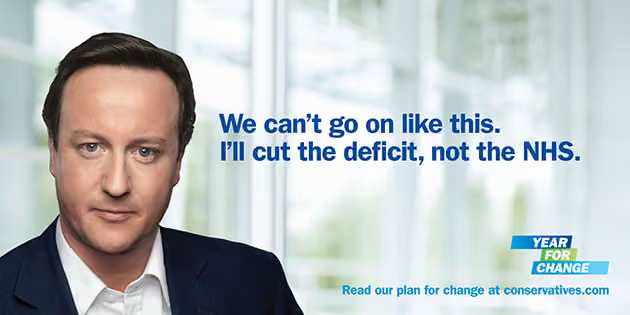
We'll Cut The Deficit Not The NHS
-
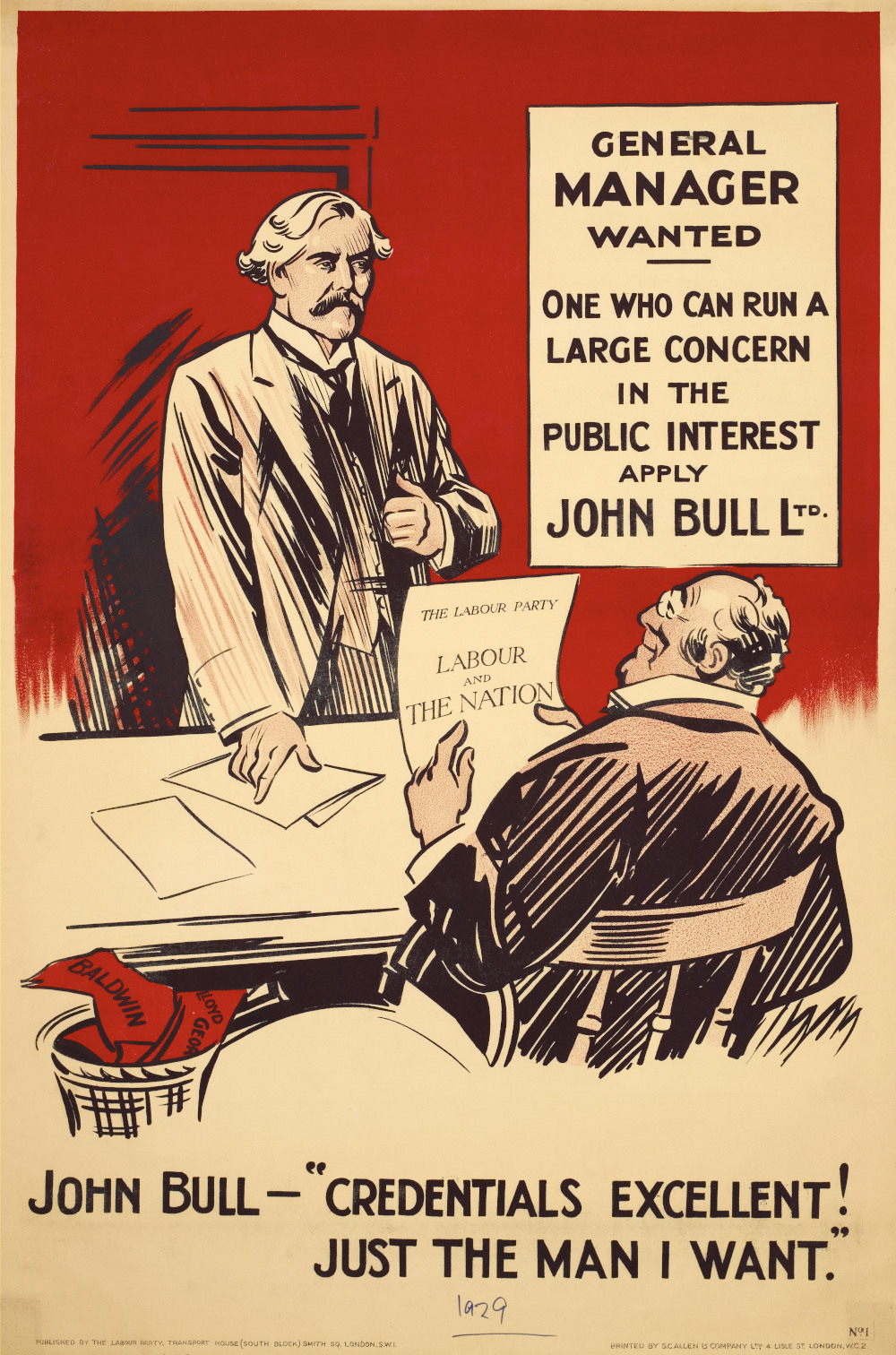
General Manager Wanted
-
-
Symbolism when pictures do the talking
-
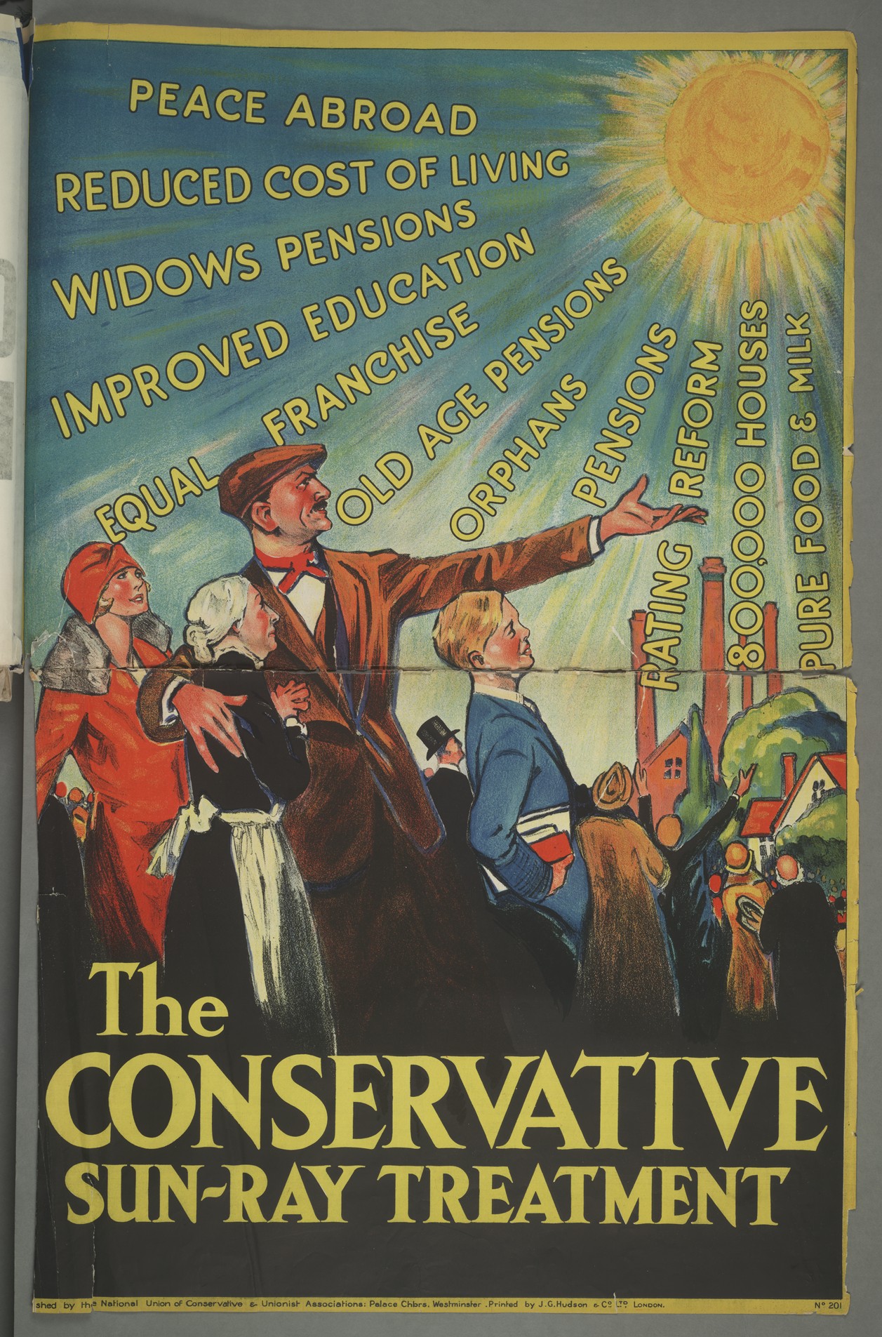
“Sun-Ray” treatment, 1929
-
They Brought Use From Slums to Sunshine
-
Five Years to Finish the Job
-
It's time for Labour
-
-
1950-1979: Selling Politics Like Soap Powder.
-
Life’s Better With The Conservatives
-
It’s Time For a Change
-
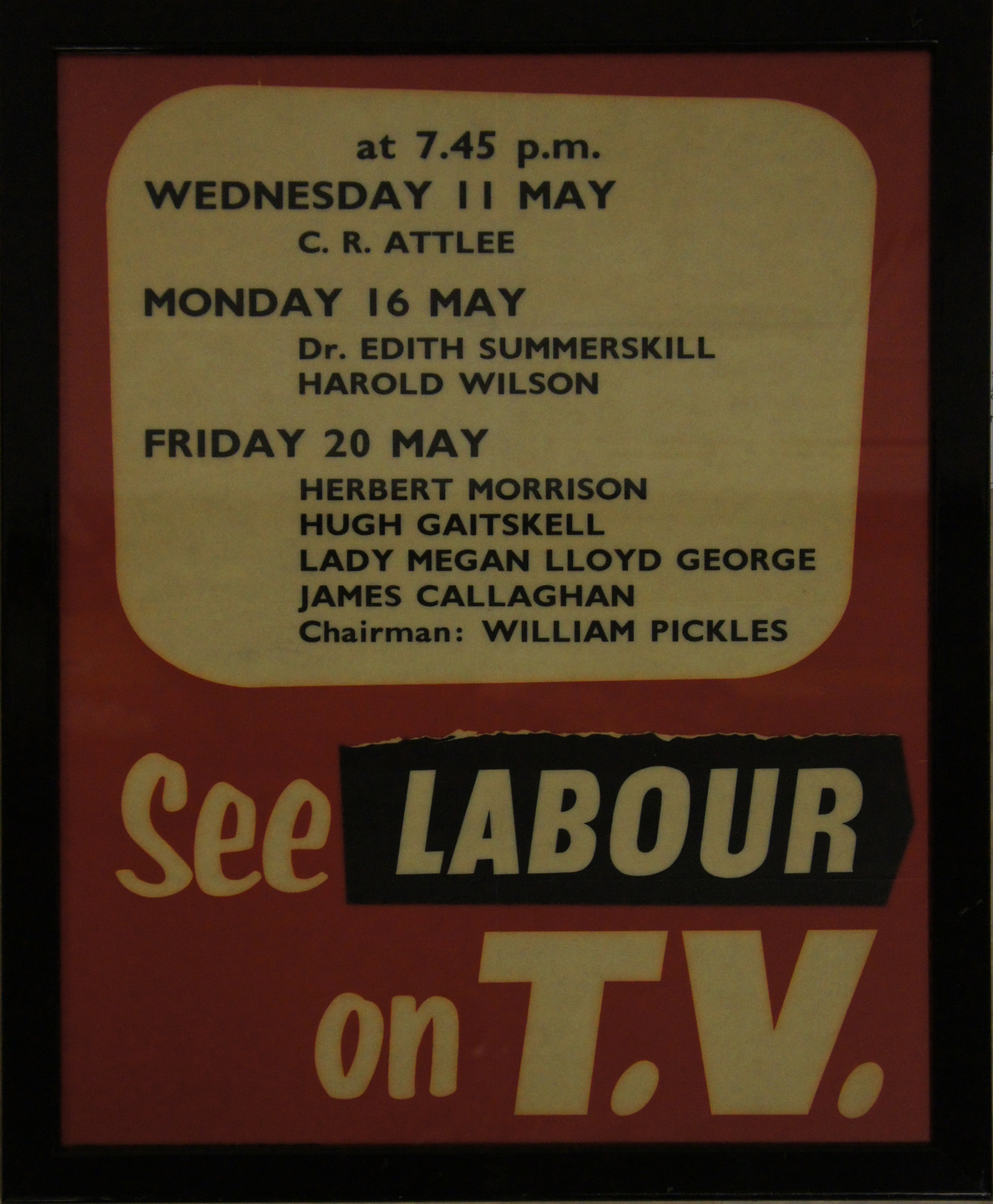
See Labour on TV
-
-
After 1979: Labour Isn’t Working and its Aftermath
-
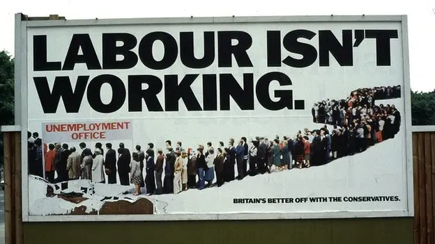
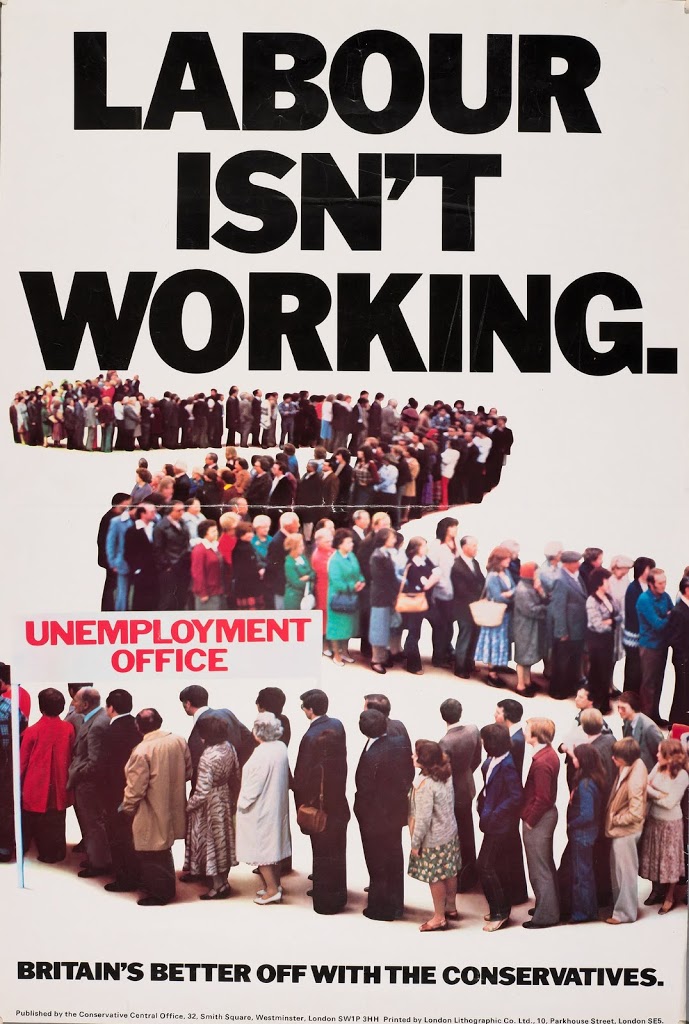
Labour Isn't Working
-
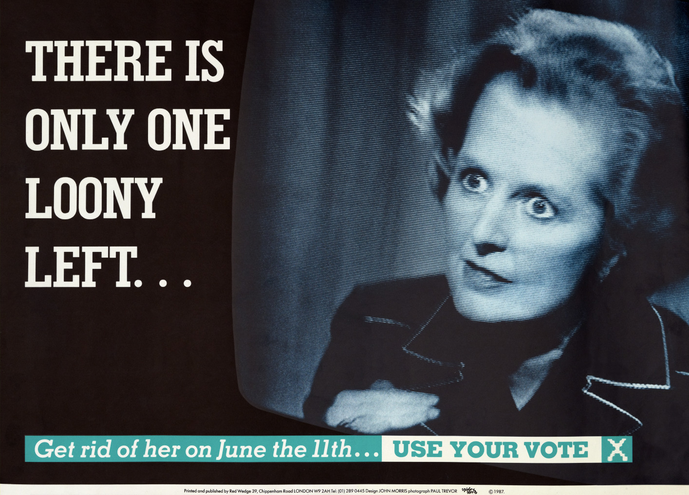
There is only one loony left
-
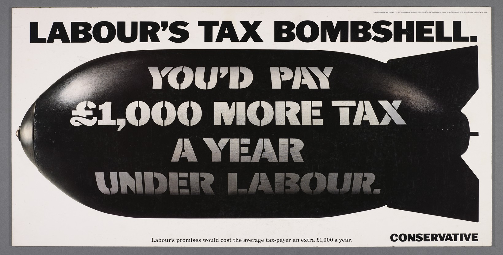
Labour’s Tax Bombshell
-
Labour’s Double Whammy
-
Tory Defence Policy
-
Tory Education Policy
-
Labour Party Election Broadcast, 1997
-

Suggested Donation Levels
Congratulations!
You scored:
x
x
What have you learned?
The Workers Burden, 1910
Two rival organisations issued these posters on in late 1909. A Liberal pressure group, the Budget League produced the first, while the Conservative supporting Budget Protest League was responsible for the other. The Times newspaper stated that The Worker’s Burden was a “reply” to the Poor Man’s Burden. Both posters use the same symbols, but the words change the meaning. In Edwardian Britain (1901-1910), posters were not static deliverers of information. They contested the politics of the street. Poster artists relied on the political education of the electorate to grasp these complex conversations.
Party: Budget League (supported
the Liberals)
Election: January 1910 (Liberal
Victory)
The Poor Man’s Burden
Party: Budget Protest League
(supported the Conservatives)
Election: January 1910 (Liberal Victory)
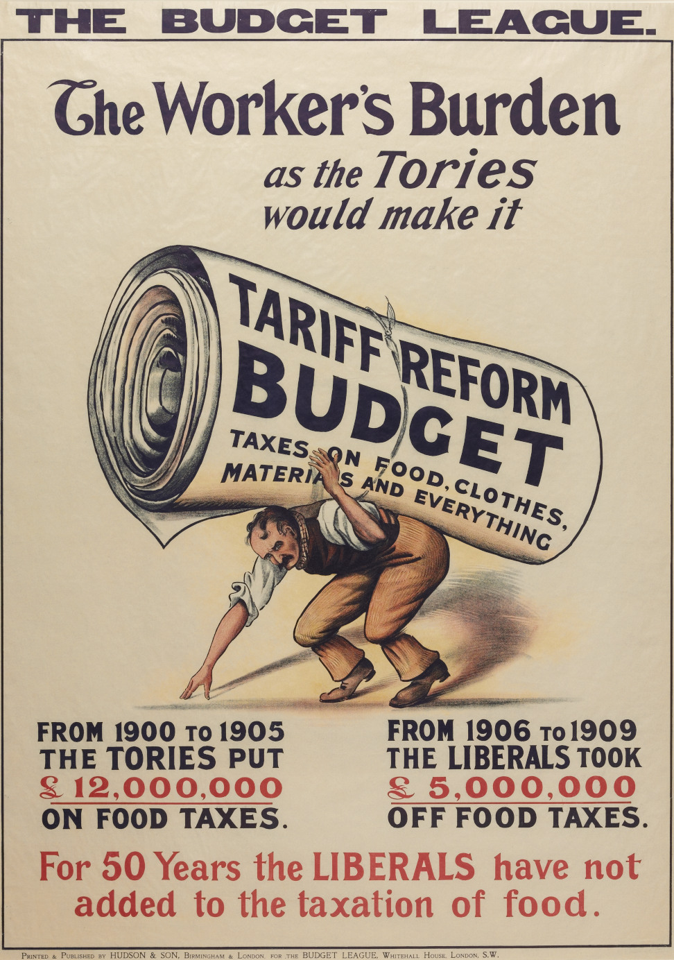
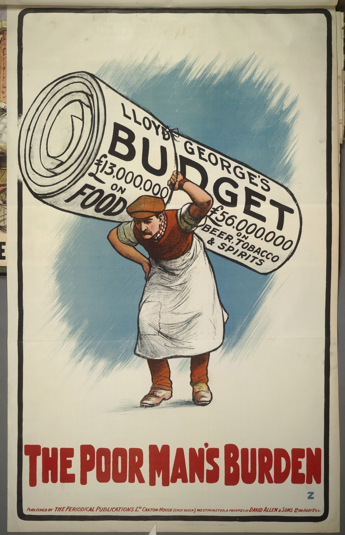




The Only Hope is Tariff Reform
Tariff Reform refers to the taxing of imports into Britain. It was a major issue during the Edwardian period (1901-1910). The artist of this poster has used a number of symbols to emphasise the benefits of Tariff Reform. The tug of Tariff Reform is pulling the British Constitution off the rocks of socialism in the turbulent seas of Free Trade. The poster represents Britain twice. Its history as a sea fairing nation is evident in the ship. British industrial might is in the background as the sun rises over the smoking chimneys. As in many posters of the period the meaning was created through the combination of slogan and labelled image.
Party: Conservative
Election: 1906? (Liberal Victory)
Don't Try the Impossible
In this poster the artist John Hassall suggests that the electors should not support the Liberals who were crippled by trying to accommodate the wishes of their rich capitalist members and the Labour party. The Liberal Prime Minister H.H. Asquith is in the middle, confused by the two competing sides. The Conservatives would have approved design from a sketch, probably the one on the right. Hassall would then have produced the finished poster, which he then sent to the printers. He completed this example on the 8th October and charged £25.00 for the design.
Party: Conservative
Election: December 1910 (Liberal victory)
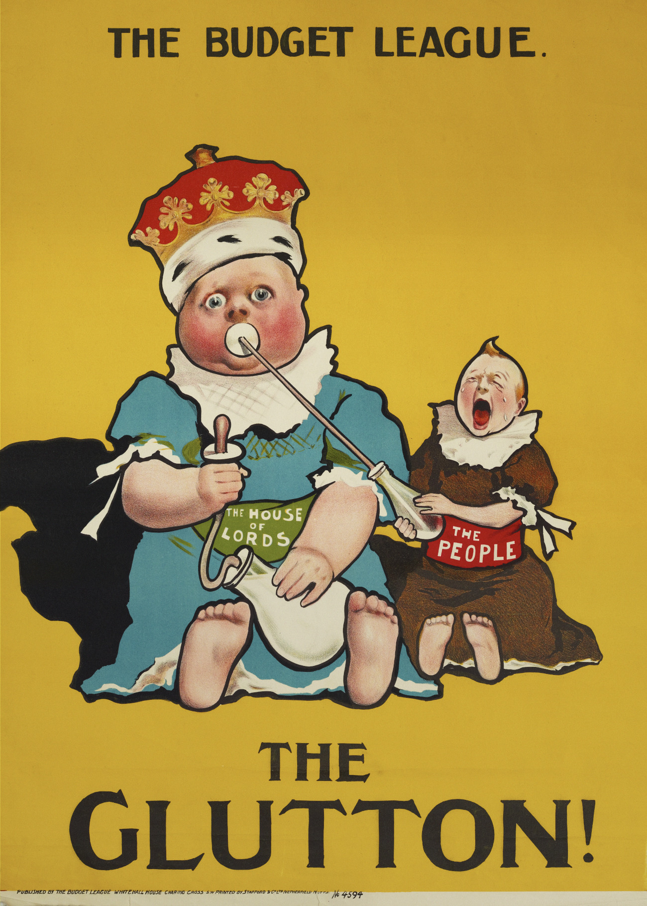
The Glutton
In 1910 Liberal and their allied Budget League posters attacked members of the House of Lords. As British Liberal Prime Minister David Lloyd George made regular reference in his speeches to the idle Lords. Posters regularly showed the Lords to be lazy unwilling to remove their hands from their pockets to help. It was the vice of greed, however, upon which opposition billboards focussed their most virulent attacks. Here the expertly drawn piggy eyes and red face of the milk stealer conveys the image of a figure that was full but still demanded more.
Election: January and December 1910 (Liberal victory)
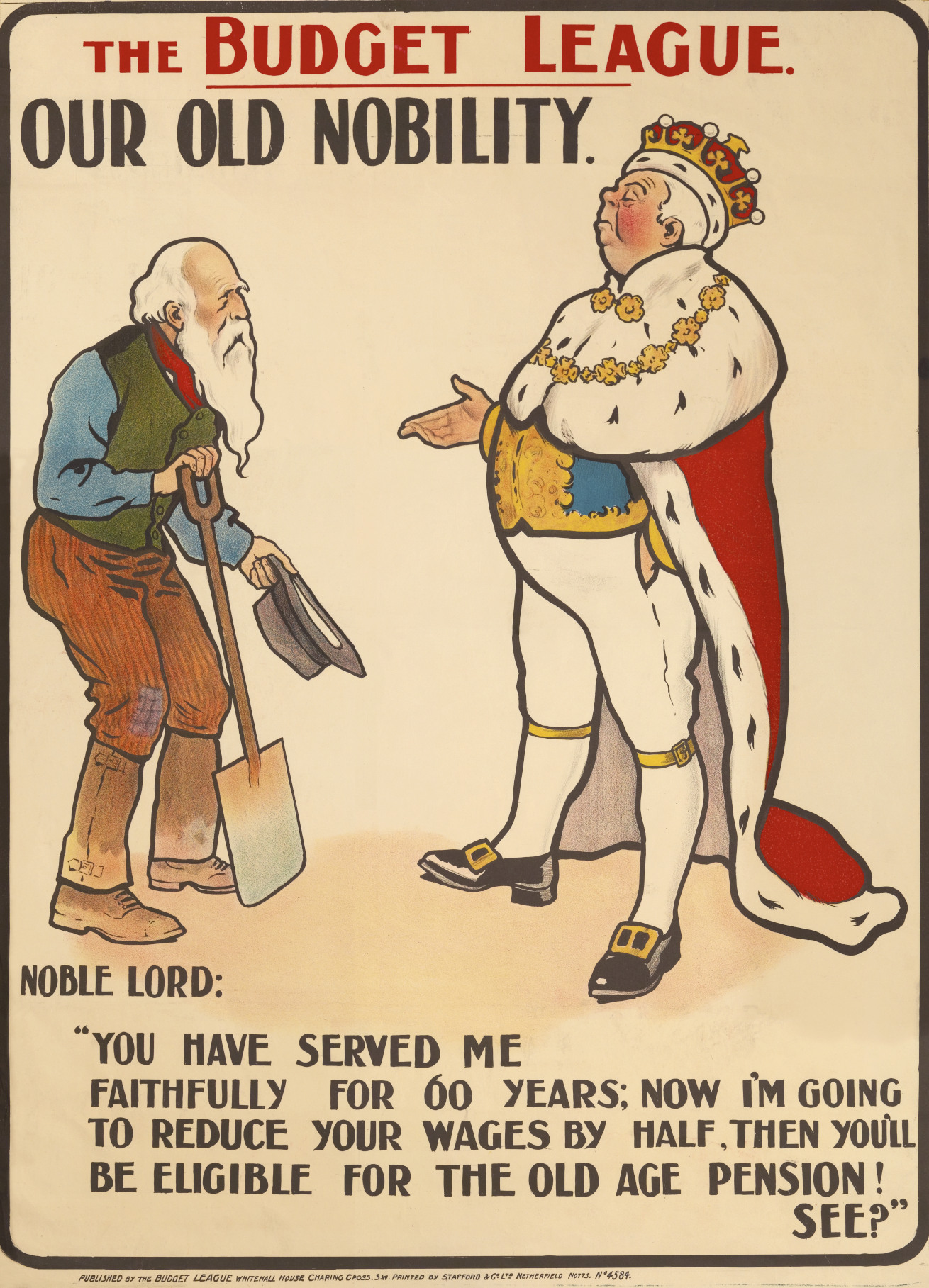
Our Old Nobility, 1910
This poster leans into a familiar visual language of the time. A wealthy aristocrat, hands in pockets, is shown cutting a worker’s wages—using body language to suggest detachment and privilege. The contrast is clear and deliberate, framing the worker as being penalised rather than supported.
At the centre of the message is the Liberal pension reform. The image presents it not as a benefit, but as justification for reducing wages—turning a social policy into something that could be used against working people.
It also connects to a wider political moment. The Budget League, a pressure group formed after the House of Lords blocked David Lloyd George’s “People’s Budget,” used imagery like this to challenge opposition and shape public perception.
Like many posters of the period, it keeps the message direct. A single scene, clearly staged, doing the work of a much longer argument.
Party: Budget League (Liberal pressure group)
January election, 1910 (Liberal victory)
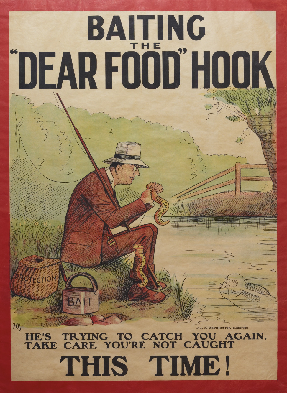
Baiting the ‘Dear Food’ Hook
The figure in this poster is Joseph Chamberlain. Francis Carruthers Gould, the artist made sure that viewers understood this by depicting him with his distinctive monocle. Chamberlain was in favour of Tariff Reform, and believed that if imports were taxed there would be more employment and higher wages. Carruthers Gould argues, that is merely to attract you, the viewer, and the real outcome is higher prices. The fishing apparatus, the creel and the bait can, are labelled with his true motifs, protection and bait. Fishing was a popular metaphor in posters. The idea that parties were tricking voters into acting a certain way, was highly relevant during election periods.
Party: Liberal
Election: 1906 (Liberal victory)
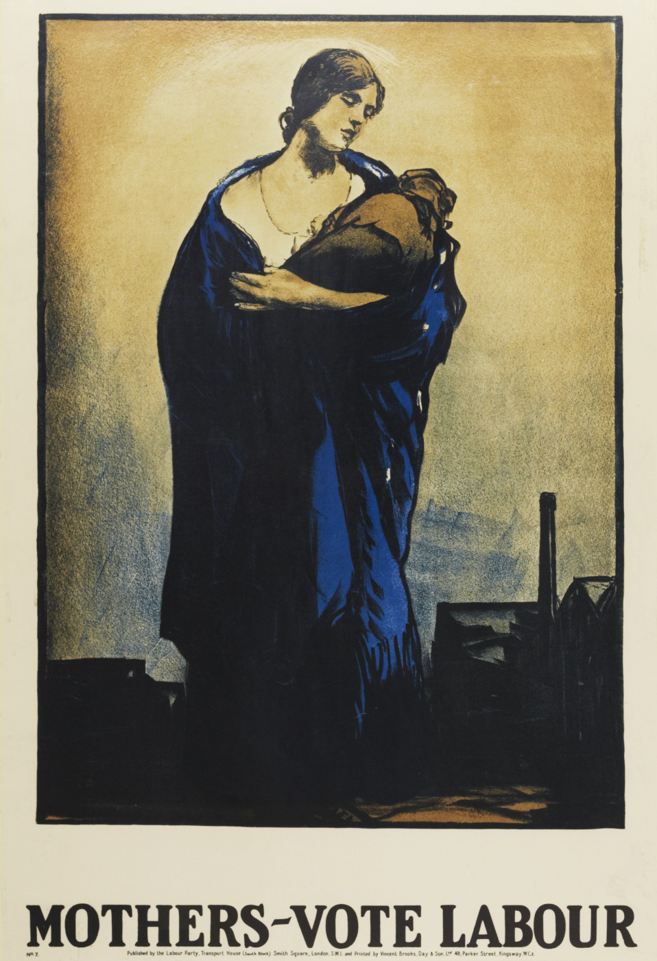
Mothers Vote Labour
Women could first vote in parliamentary elections 1918. This poster, designed by Gerald Spencer Pryse, is Labour’s first attempt to attract these new voters. During the period, Labour Party support came primarily from industrial areas, emphasised by the factory in the background. The basis of the poster’s appeal is that women should vote Labour on behalf of their children. Labour reissued this poster several times throughout the inter-war period, including in 1929, the first election men and women voted on equal terms.
Party: Labour
Election: First used 1918 (Coalition government led by David Lloyd George)
Labour Stands For All Who Work
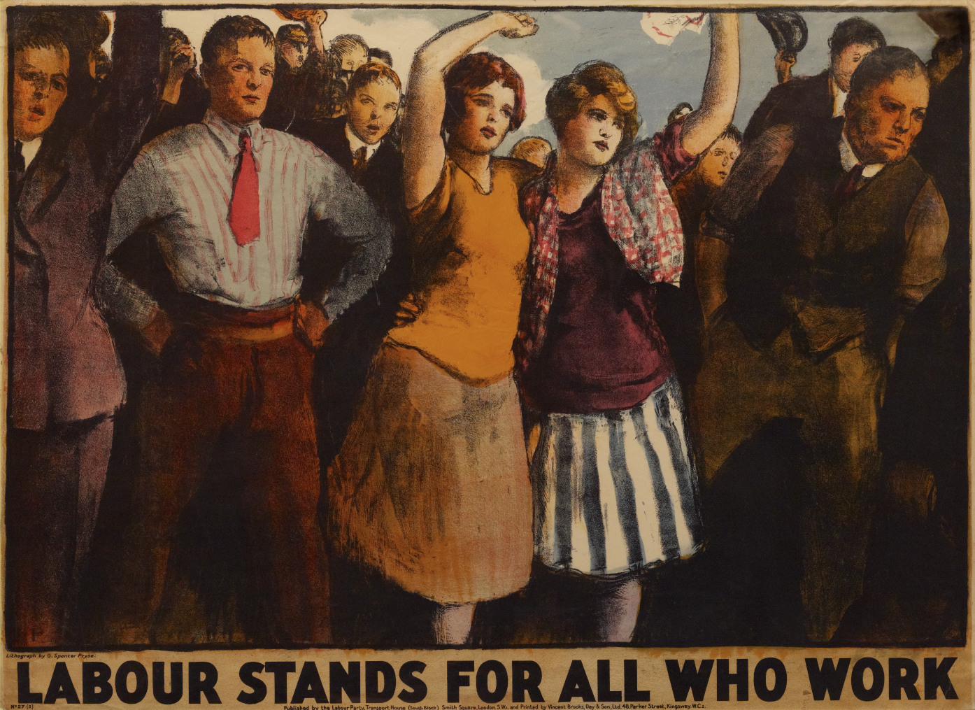
During the 1920s and the 1930s Labour expanded their appeal from their core urban, working class, trade union support and began seeking the votes of the middle class. The party used posters to when attempting this. The people in this poster are dressed in the clothes of managerial or secretarial rather than industrial workers. Drawn by Gerald Spencer Pryse, this poster like the one on the right, is one of the few examples that acknowledges many women were in paid employment.
Party: Labour
Election: Perhaps 1931 (National Government victory)
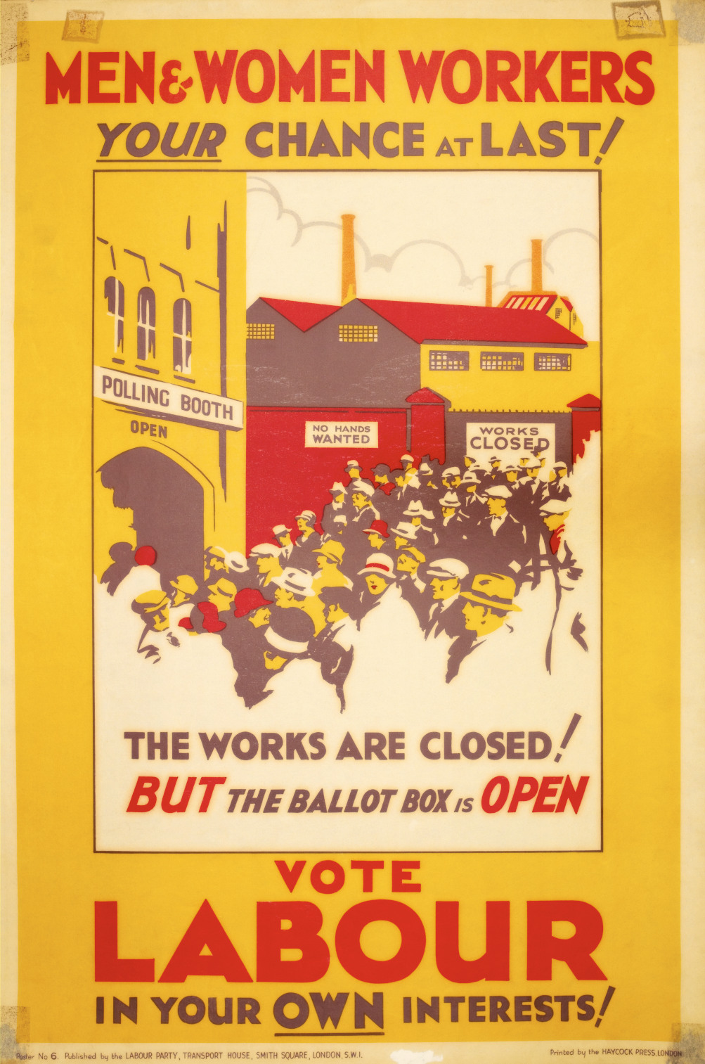
Men and Women Workers, Your Chance at Last
This poster is rare in that it recognised that women might choose to vote as something other than mothers or consumers. The women in the centre stares at the viewer in a direct personal appeal. As Men and women stream out of the closed works towards the polling booth. There the poster urges, they should vote for Labour.
Men and Women Workers, Your Chance at Last
Party: Labour
Election: 1929 (Labour victory)
THE NEW VOTER
This Labour poster from 1929 shows Liberal leader David Lloyd George and Conservative leader Stanley Baldwin as old- fashioned. Their top hats and morning coats contrast sharply with Ramsay MacDonald’s, lounge suit and homburg, very much the modern man. Lloyd George’s macabre wink hinted at his reputation as a serial philanderer.
It was a poster demonstrating the fluidity of visual symbols. In Conservative posters Baldwin’s pipe was a reassuring sign of geniality; here, it represented an out of touch old man.
Party: Labour
Election: 1929 (Labour victory)

Fair Play For Women
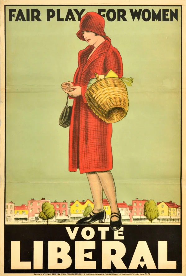
Originally submitted to a poster competition organised by the Liberal Party, “Fair Play for Women” quickly stood out for its bold visual messaging. While The Manchester Guardian described the figure as standing before a row of “dainty” suburban houses, the artwork actually places her towering above a vibrant stretch of colourful shopfronts.
The composition presents a woman dressed in contemporary fashion, her modern silhouette dominating the urban backdrop. Rather than domestic suburbia, the surrounding retail parade suggests prosperity and commercial life. Together, the figure’s confident stance and the lively storefronts communicate a clear sense of affluence and modernity.
Party: Liberal
Election: 1929 (Labour victory)
Safety First
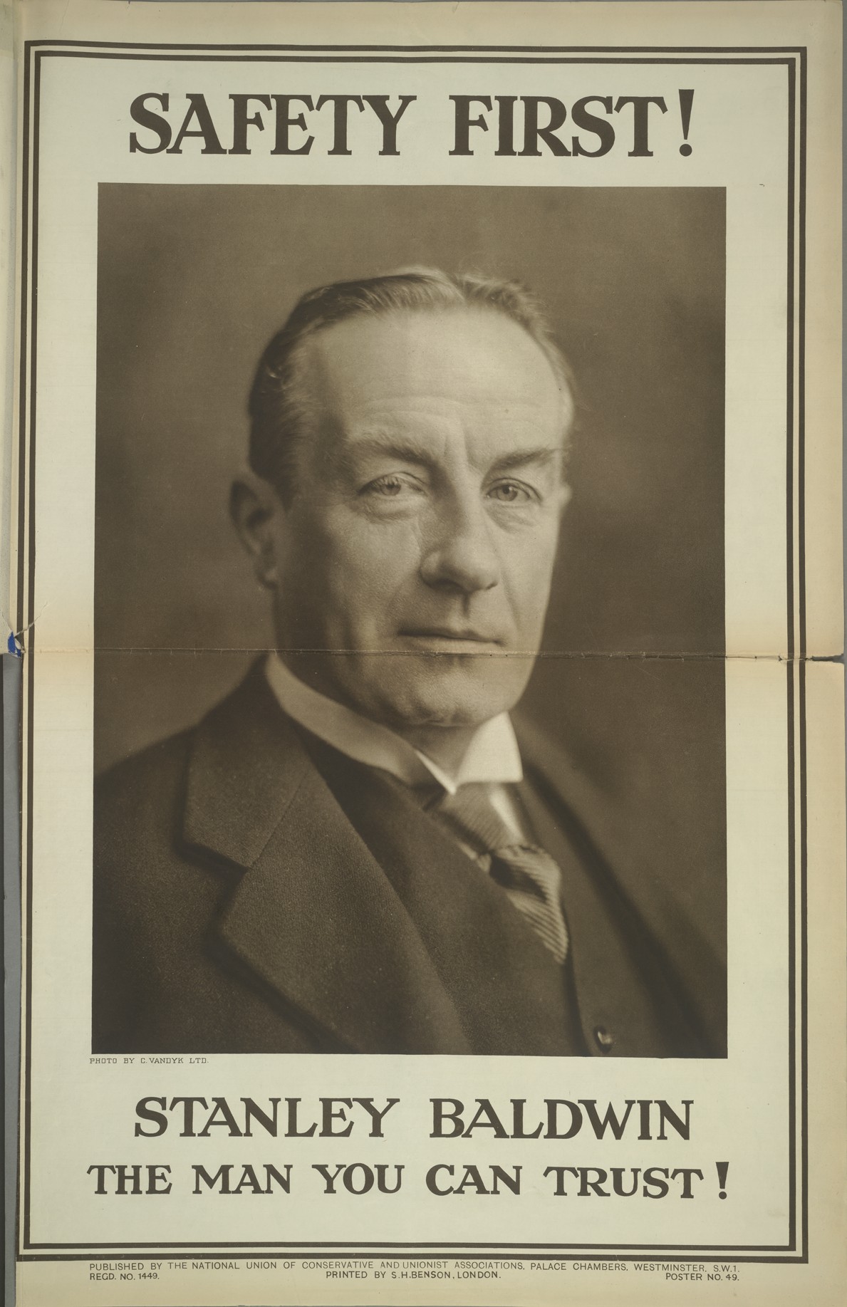
The idea of trust is central to this poster. Clearly it says so at the bottom, but even if it did not the image of Conservative Prime Minister Stanley Baldwin is full of trustworthy symbols. Upright, solid, formal it is every inch the image of inter-war leadership. The most important signal of the Baldwin’s trust, however, is his gaze. Plato suggested “the eyes are the windows to the soul”. Baldwin’s unwavering stare signifies that he is not unnerved by the task of leadership. This poster ultimately suggests that Baldwin has nothing to hide.
Party: Conservative
Election: 1929 (Labour victory)
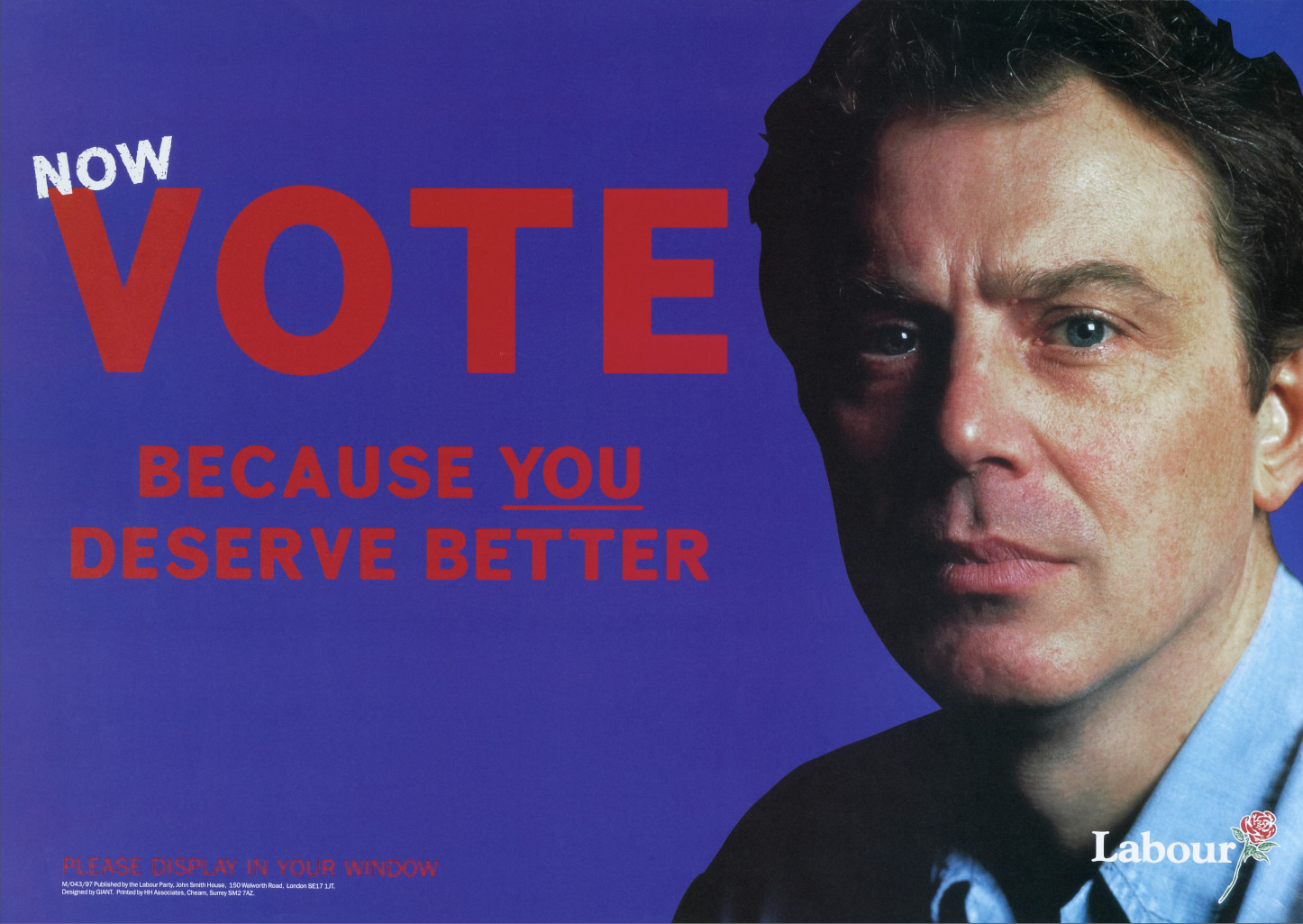
Because Britain Deserves Better
This hardly looked like a traditional political poster, and that was part of its appeal. Tony Blair appeared youthful and approachable, especially contrasted to the greyer, more conventional image of the Conservative leader and Prime Minister John Major. Blair seemed to represent something newer and more modern.
Blair's relaxed appearance also challenged older ideas of politics being dominated by stiff, formal men in suits. In some campaign images he even appeared without a tie, reinforcing the sense that this was not Blair the international statesman, but Blair as a modern British leader. The rolled-up sleeves suggested a willingness to work hard and “get his hands dirty,” while the loosened tie gave him the appearance of someone ordinary and relatable, almost like a father arriving home after a long day at work.
The overall effect was carefully styled but subtle: politics presented with a more contemporary and human image.
Party: Labour
Election: 1997 (Labour victory)
We'll Cut The Deficit Not The NHS
In January, 2010 the Conservatives dropped a billboard
campaign built around an oversized portrait of David Cameron and the
line: “We can’t go on like this. I’ll cut the deficit, not the NHS.” The
image appeared across 759 billboards nationwide.
But instead of looking authentic, the poster landed
somewhere between politics and premium skincare. Cameron’s heavily retouched
face became the story, with critics immediately mocking the airbrushed
aesthetic. The internet turned it into meme material, while posters in the
street were frequently vandalised and rewritten.
Party: Conservative
Election: 2010 (Conservative victory, in coalition with Liberal Democrats)
General Manager Wanted
In this poster the Labour leader James Ramsay MacDonald applies to John Bull for the job of Prime Minister. Bull has already rejected the application of the Conservative and Liberal leaders Stanley Baldwin and David Lloyd George. Instead, he decides on Ramsay MacDonald after reading the Labour manifesto ‘Labour and the Nation’. Here John Bull represents the ability of the British to make the correct rational decision. John Bull featured infrequently in Labour posters. More usually he appeared in Conservative posters and commercial advertising as a symbol for British made goods.
This stateman like image makes an interesting comparison with depictions of Lloyd George during the same election as he appealed to new voters.
Party: Labour
Election: 1929 (Labour victory)
“Sun-Ray” treatment, 1929
Borrowing the visual language of medical advertising, this
poster reworks the idea of “Sun-Ray” treatment, a popular therapy for
tuberculosis. Conservative policy is presented as the cure capable of restoring
the nation itself.
The unknown designer leans heavily into the symbolism. Rays
stream outward across the composition, suggesting energy, recovery and national
renewal. At the same time, the poster carefully stages an image of Britain as
socially unified. Men and women of different classes appear together all
gathered beneath the same political sunlight.
At a moment when many Conservatives feared growing class
division and the threat of social conflict, the poster sells cohesion as much
as policy. Its message is less about individual voters than about the idea of a
single national community, healed and held together through Conservative
government.
Party: Conservative
Election: 1929 (Labour victory)
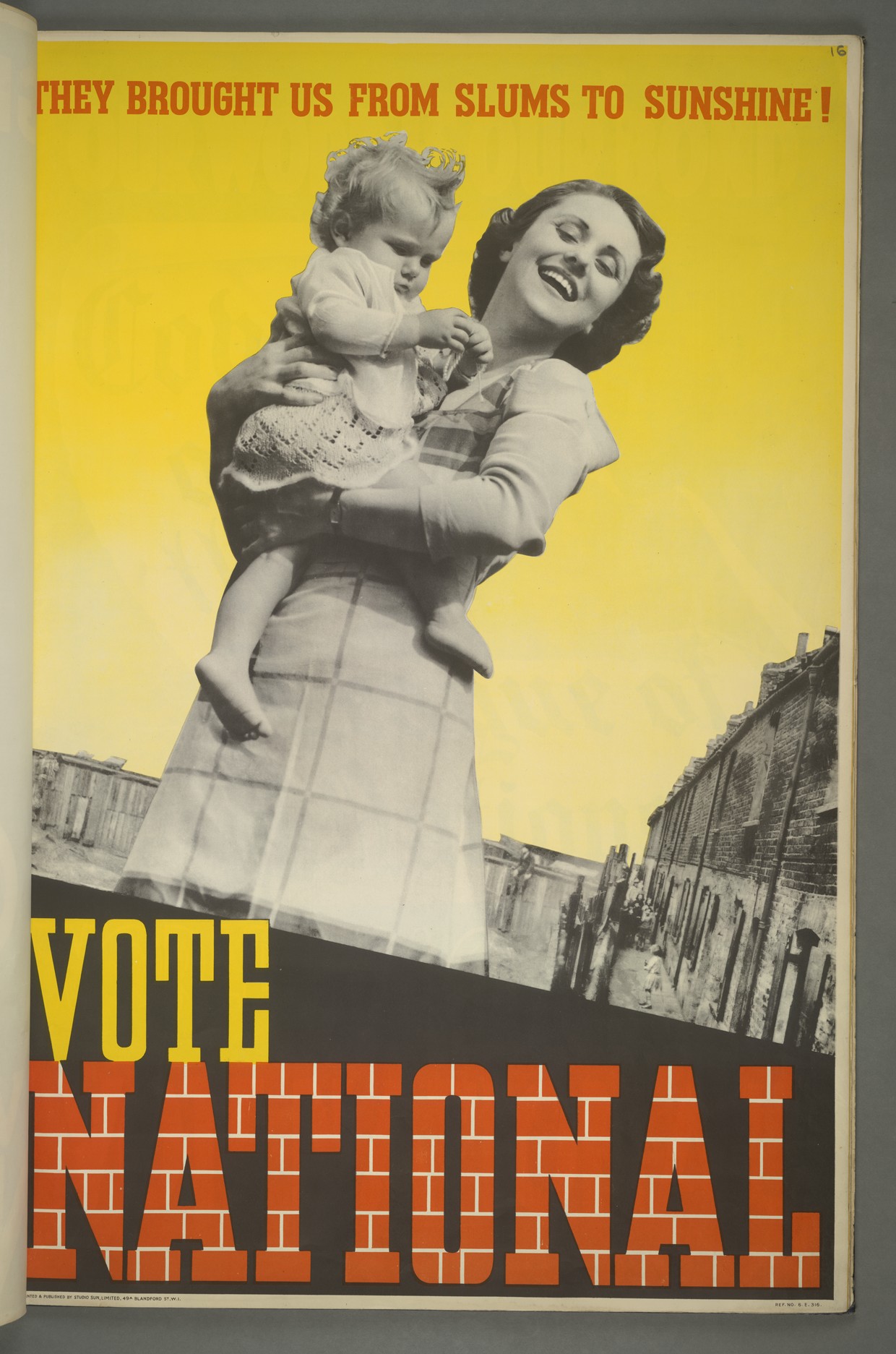
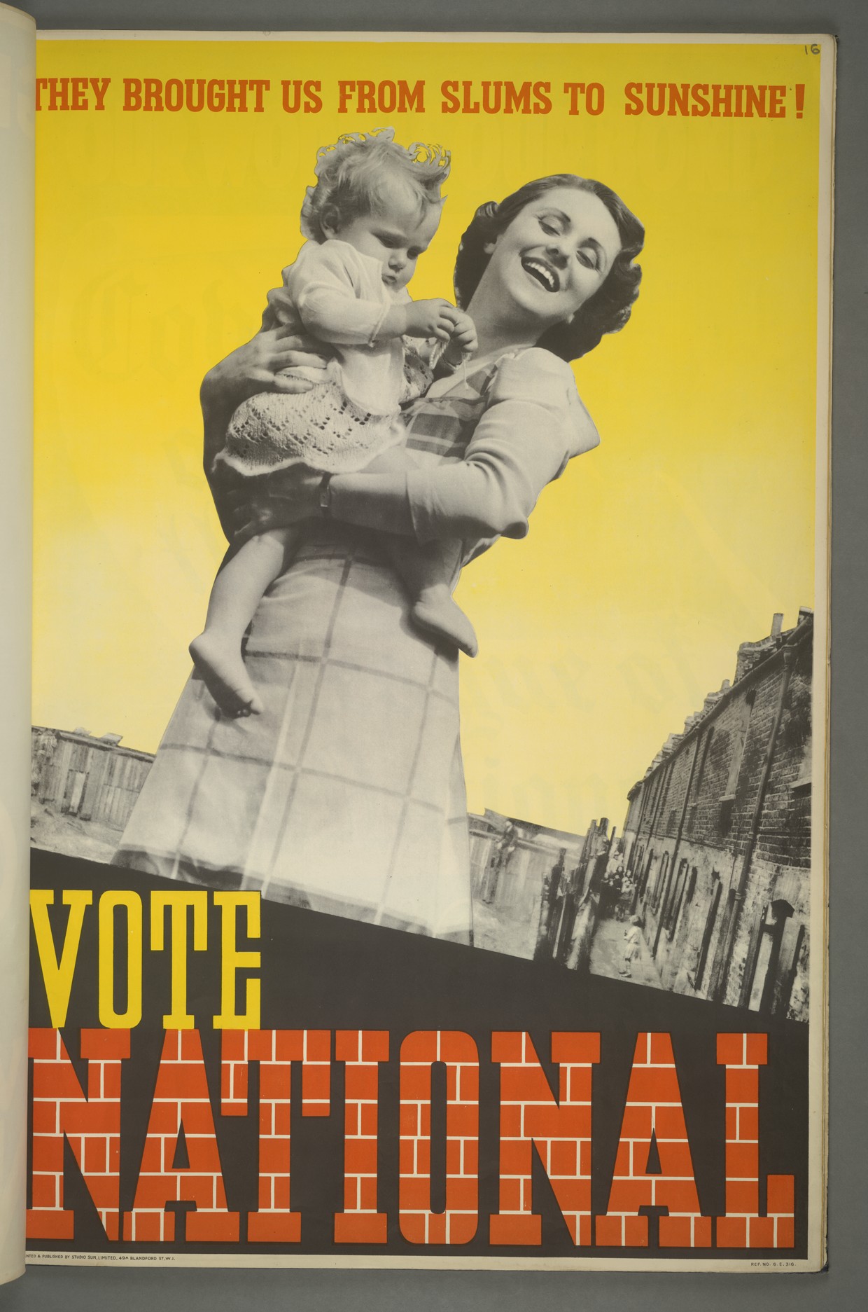
They Brought Use From Slums to Sunshine
This barely reads like a political poster at all. The sharp
angles, staged poses, and graphic brickwork feel closer to a high-end fashion
photography than election propaganda. It’s less Westminster, more avant-garde
magazine cover.
The image was produced by Studio Sun, a photographic studio
better known for fashion imagery than political campaigning. The composition is
hyper-styled: monochrome figures cut hard against an almost radioactive yellow
backdrop, turning the contrast between urban deprivation and “sunshine” politics
into something cinematic.
The whole thing feels aggressively modern for its time.
Slick. Designed. Aspirational.
The National Government wasn’t just selling
policy it was selling a mood, a future, a lifestyle upgrade. Using cutting-edge
photographic techniques signalled modernity as much as the message itself.
Party: National Government
Election: 1935 (National Governement - led by Conservative Stanley Baldwin)
Five Years to Finish the Job
Such was Labour Prime Minister’s fame as a pipe smoker,
people would know that the pipe in this poster was him. The represented
solidity, reliability and purpose. Born in Huddersfield, Yorkshire, Wilson was
working class. The pipe speaks to those roots. However, the Oxford scholar and
academic preferred cigars when not in front of the camera.

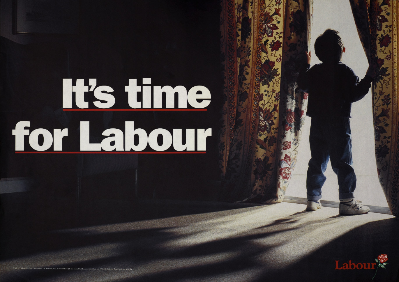
It's time for Labour
This poster taps into two of the most powerful visuals in
the language of optimism: children and the break of day. It’s a clean,
cinematic pairing of youth meeting sunrise signals hope, but also hints at
something deeper: discovery and new beginnings.
There’s heritage baked into this line too. Neil Kinnock
famously closed his foreword to Labour’s 1992 manifesto with it, and doubled
down by making it the final note in every campaign speech. Here, that same sentiment gets recontextualised through imagery that
feels both timeless and forward-facing, elevating a political message into
something almost universal.
Party: Labour
Election: 1992 (Conservative victory)
Life’s Better With The Conservatives
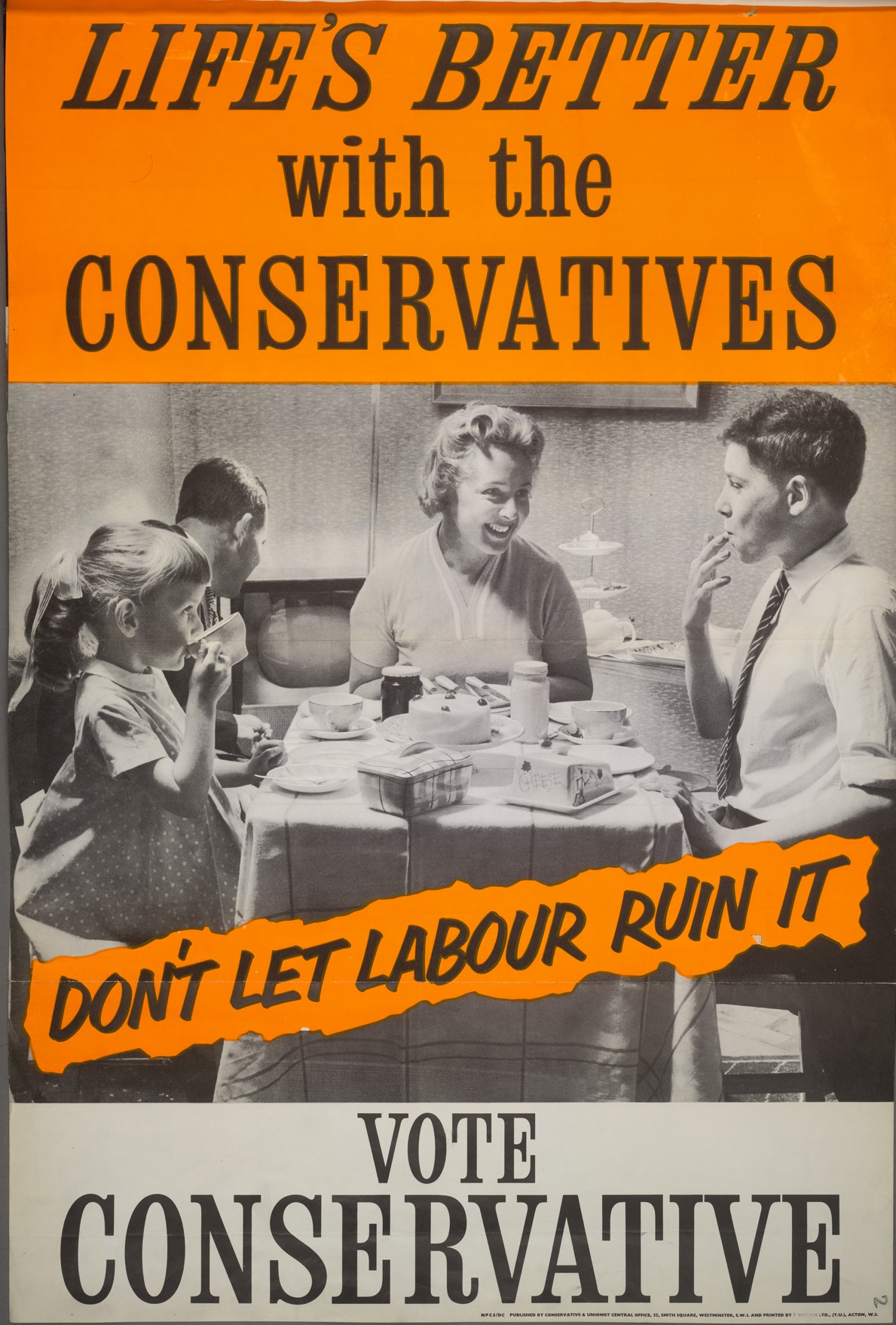
This poster quickly becoming one of the most recognisable pieces of political advertising. Developed by Colman, Prentis & Varley for the Conservatives, with the slogan crafted by Geoffrey Tucker and Ronald Simms, it shows how campaign messaging was becoming more structured and deliberately styled.
At its core, the poster balances two ideas. On the surface, there’s a clear sense of optimism, a prosperous, contented family used to project stability and everyday success.
The pairing of slogan and imagery keeps things direct. It suggests that modern, aspirational items, like televisions, could become part of ordinary life. It's not about detailed policy but a broader vision of progress and comfort.
The impact was immediate enough to draw criticism at the time. One Labour MP famously remarked that the Conservatives were “selling politics like soap powder,” a line that captured how closely political communication was beginning to mirror commercial advertising.
Poster: Conservative
Election: 1959 (Conservative victory)
It’s Time For a Change
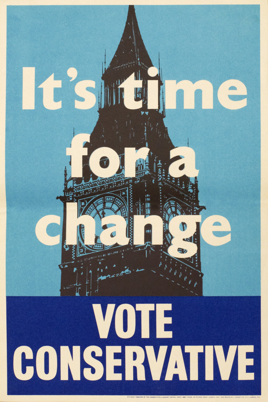
As the twentieth century moved on, poster design started to strip things back—and by the 1950s, that shift picked up pace. What you see here fits squarely into that transition: a cleaner, more focused approach that leaves little room for distraction.
From around 1945, a new formula began to take hold. One strong central image, paired with a short, direct slogan. It was a move towards clarity—making sure the message landed quickly and stayed with the viewer.
The change wasn’t total. More detailed, complex designs still appeared from time to time. But increasingly, they felt out of step with the direction campaigns were heading. Simplicity was becoming the standard, not the exception.
Party: Conservative
Election: 1951 (Conservative victory)
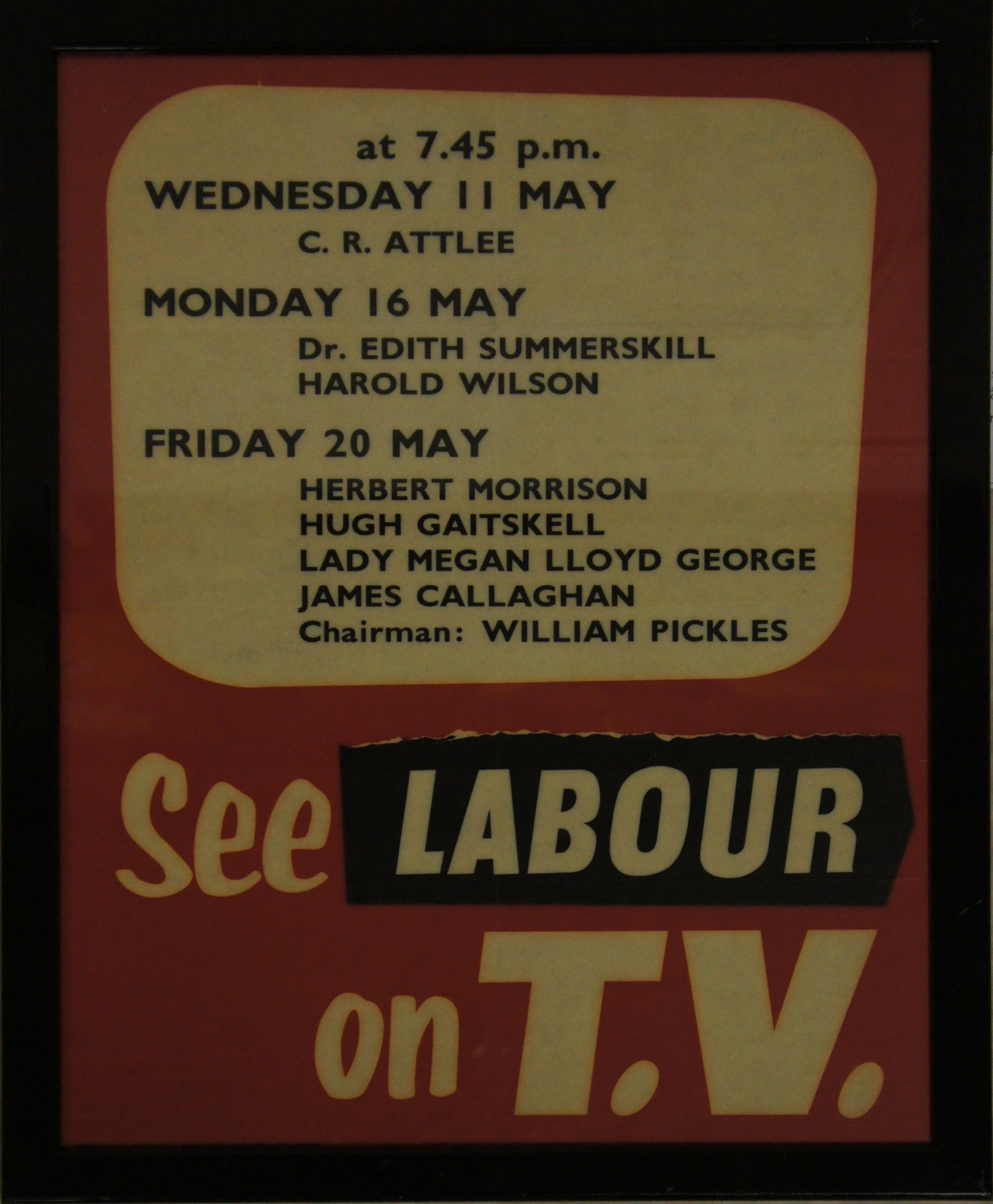
See Labour on TV
Television reshaped how election campaigns were fought. Building on what radio had already started, it shifted politics out of public spaces and into the home; something watched, rather than attended.
That change could have made posters feel redundant. But instead of disappearing, they adapted. Just as earlier posters had been used to promote public meetings, campaigns in the 1950s began using them to point audiences toward party election broadcasts.
This poster highlights the time and date of Labour’s 1955 Party Election Broadcasts, guiding viewers on when to tune in. The first party election broadcast had only been introduced a few years earlier, in 1951. By 1955, it was clear that campaigns weren’t just about being seen in public any more, they were about being watched at home.
You can see the 20th May Election Broadcast in the clip
Party: Labour
Election: 1955 (Conservative victory)
Labour Isn't Working
Often described as the most famous British political poster, this design set a benchmark for what campaign messaging could achieve. It brings together image and slogan in a way that creates two clear, overlapping meanings.
On one level, it points to the challenges facing Jim Callaghan’s Labour government; rising inflation, ongoing strikes, and a sense of instability. On another, it taps into a more immediate concern: the fear of unemployment. A personal message that goes beyond headline issues.
Some have argued that the poster itself secured the Conservative victory in 1979. That claim is debated, with events such as the Winter of Discontent playing a major role in shaping public opinion.
What is harder to dispute is how effectively it captured the mood of the time. By combining a simple visual with a direct line, it reflects a moment when public concern, political messaging, and design all aligned. From this moment all political posters would be judged against this one.
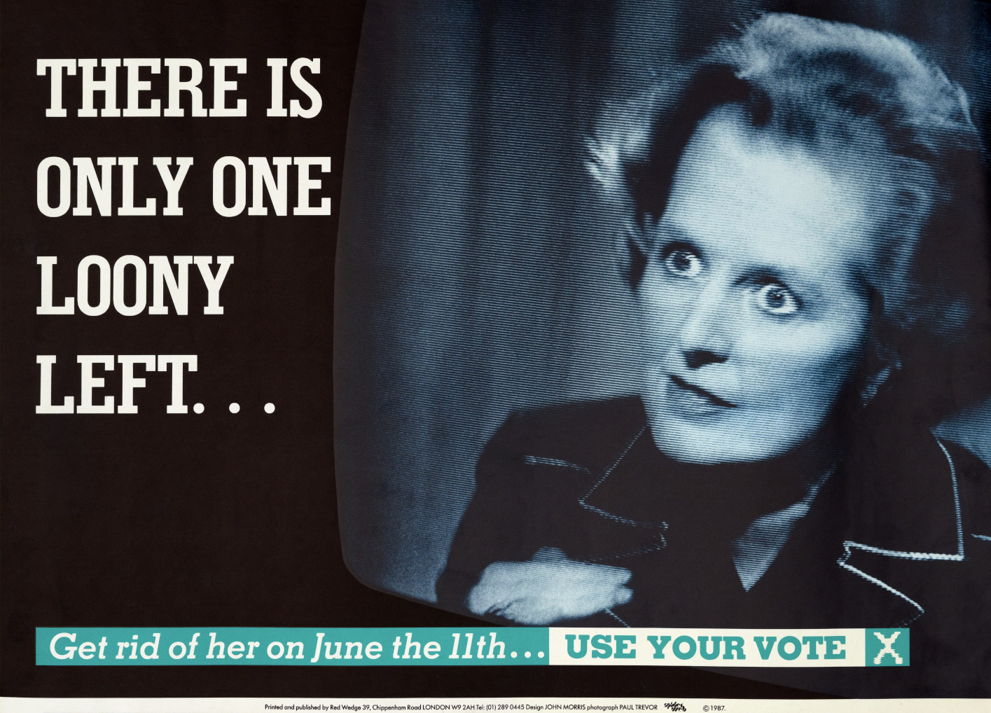
There is only one loony left
Billy Bragg, Paul Weller, and Sade were some of the musicians that formed Red Wedge in November 1985. The organisations aim was to unite anti-Conservative youths. The poster’s slogan is a reference to the phrase that the press used to criticise the policies of Labour controlled councils, most notably Liverpool and Lambeth. This poster twists the phrase. Margaret Thatcher’s squint, her unearthly glow and the vintage television echo a 1950s sci-fi movie and suggest that she was not of this world.
Party: Red Wedge (Organisation of musicians affiliated to Labour)
Election: 1987 (Conservative victory)
Labour’s Tax Bombshell
This poster was all about impact. A single idea, pushed hard: Labour’s policies come at a cost. The “bombshell” framing turns that message into something urgent and attention-grabbing, reinforced across both posters and broadcast.
The numbers do the work, £38 billion, £1250 per person, kept simple and repeated enough to stick. It’s less about detail and more about scale, giving voters a figure they can picture and react to quickly.
Visually and conceptually, it’s built to land fast. No clutter, no over-explanation, just a clear warning, delivered in a way that’s hard to ignore.
Party: Conservative
Election 1992 (Conservative Victory)
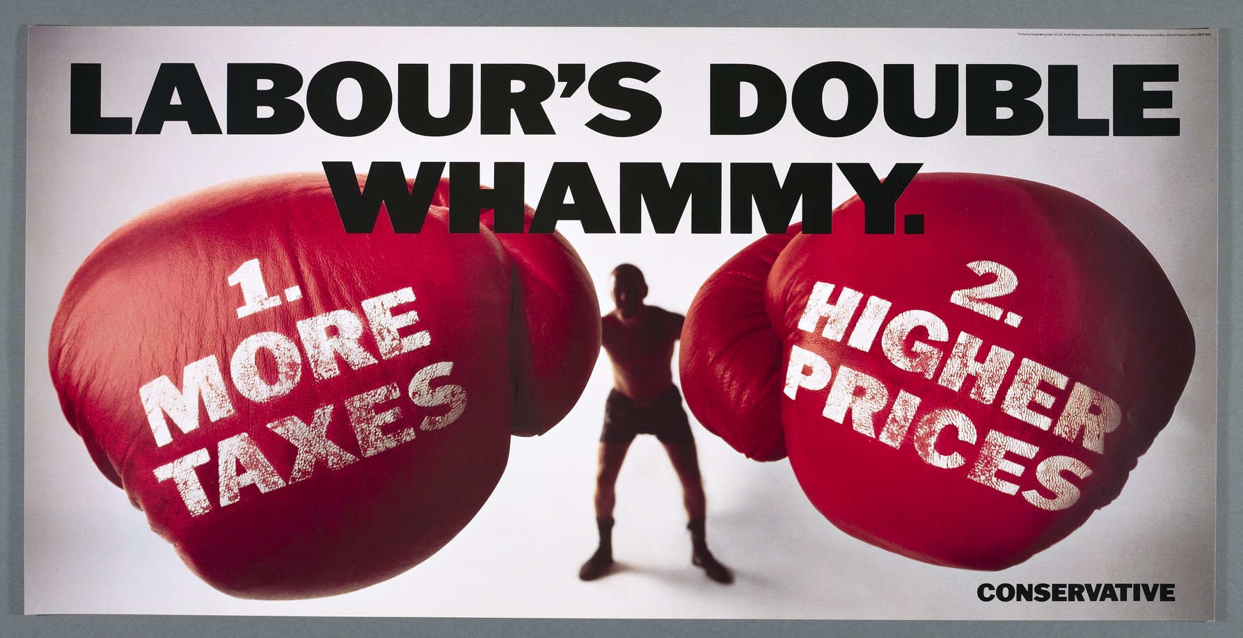
Labour’s Double Whammy
If Tax Bombshell from 1992 set up the argument, Double Whammy hits it again. The language leans into impact, borrowing the punchy Americanism “whammy” to make the message feel immediate and forceful.
The idea is straightforward: voters aren’t just facing one hit, but two. It’s a compressed way of framing Labour’s plans as a double burden, turning a complex policy debate into something simple and memorable.
Together, the posters show how the campaign approached its messaging; strip it back, repeat the core idea, and make sure it lands in seconds. Whether or not they decided the election outcome on their own - with a surprise Conservation victory - they reflect a campaign that understood how to keep a message clear, consistent, and difficult to miss.
Party: Conservative
Election: 1992 (Conservative Victory)
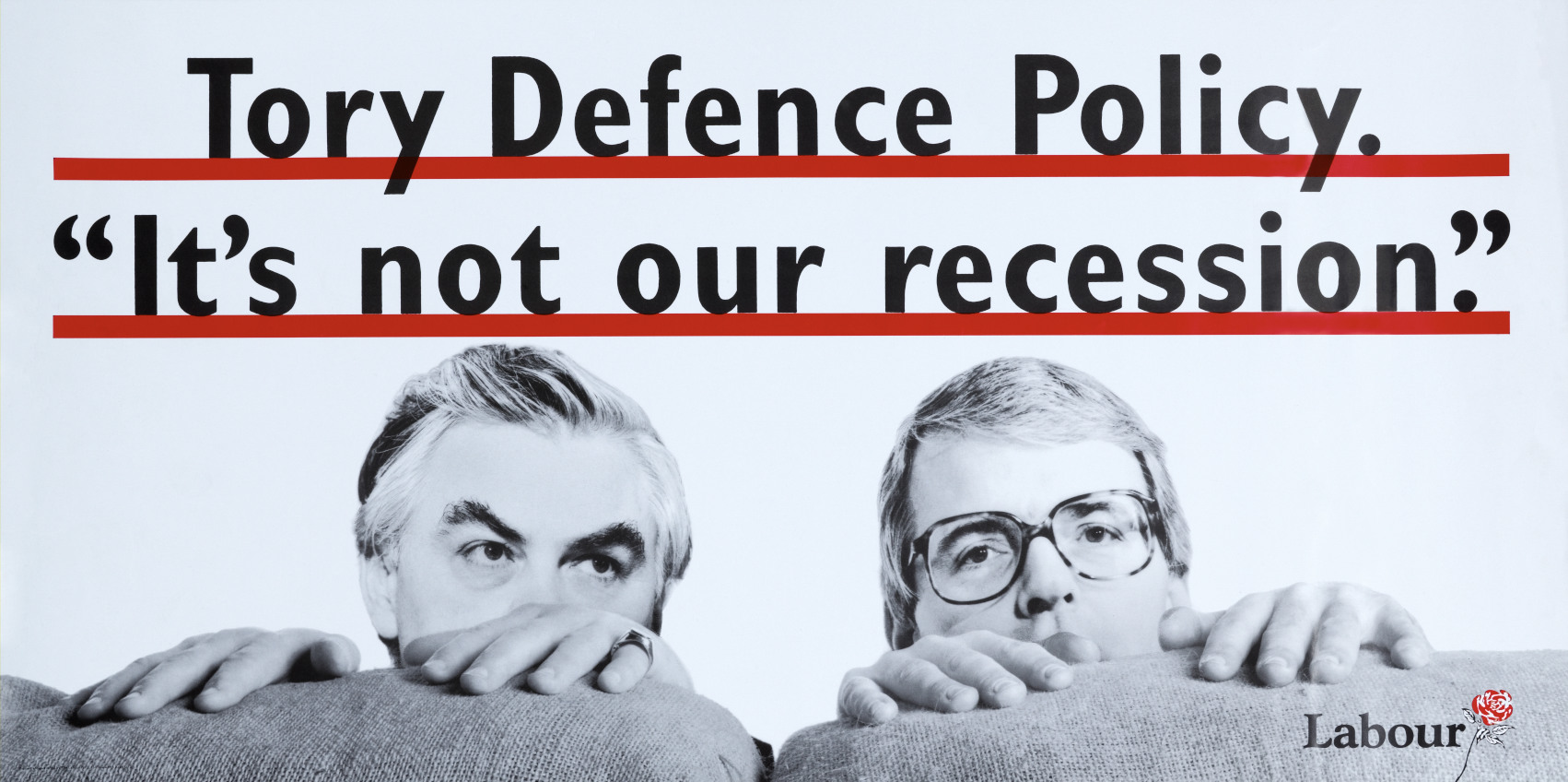
Tory Defence Policy
This poster takes a more direct, critical angle, pushing against the idea that Labour’s 1992 campaign avoided confrontation. It places two senior Conservative figures (Prime Minister John Major and Chancellor Norman Lamont) behind a sofa, a simple visual that suggests avoidance and a lack of accountability.
The message is clear without overcomplication. Rather than focusing on detailed policy critique, it uses a familiar domestic setting to frame a political point: key decisions on defence are being dodged. It’s a concise visual metaphor, designed to land quickly and stick.
Party: Labour
Election: 1992 (Conservative Victory)
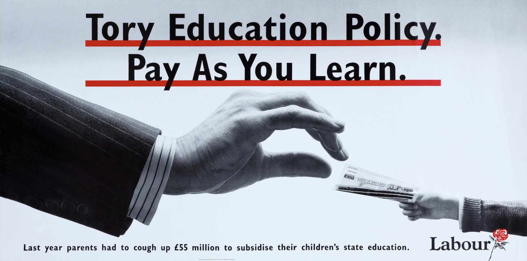
Tory Education Policy
Also from 1992 this poster shifts focus to education, using a single, striking image to communicate its message. A child is shown handing over money, with the presence of a pinstripe suit acting as a symbol of wealth and financial power.
The idea is straightforward: education is being framed as something that comes at a cost, rather than a public good. Like many posters of the period, it avoids complex explanation and instead presents a clear, immediate contrast linking Conservative policy with expense and inequality.
Together, these posters show that while Labour was criticised for not being aggressive enough in 1992, it still used sharp, visual messaging to challenge key areas of Conservative policy.
Party: Labour
Election: 1992 (Conservative victory)
Labour Party Election Broadcast, 1997
In this Party Election Broadcast from 1997 the message, the method of delivery, and the method of construction all melded into one. The broadcast became known as the Tony Blair biopic. In it he signed a poster that featured his own face, and complained that was what politics was like now. It was clear that the posters role in election had become much more than simply communicating to people in the street.
If this catalogue does not render, open it in a new tab.
Open catalogue in a new tabPicturing Politics - The British Political Poster
Snicket
Political posters have been a constant through UK elections in both the twentieth and twenty-first centuries. Even as radio, television, and the internet reshaped how campaigns reach people, posters have held their place, adapting rather than disappearing.
As the detail of elections fades over time, these visuals tend to last. They become part of a shared record, capturing how politics looked and felt in a particular moment. This exhibition follows that thread, starting with late Victorian designs and moving through to posters from the 2010 election.
What emerges is a reminder that very little in politics is entirely new. The ideas and messages may shift, but they are built on a familiar set of symbols that continue to evolve. Posters have sat at the centre of that process, where design, message, and politics come together in one frame.
The Arrival of Picture Politics
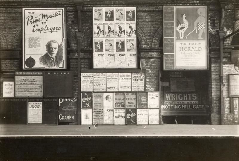
By the late nineteenth century, new printing technology made large, colour posters possible and political parties took full advantage. Many turned to well-known cartoonists, which gave early posters a look and feel close to the editorial cartoons of the time. Like those cartoons, they could be sharp, direct, and often biting in their portrayal of political rivals.
At the same time, not every poster followed this more polished approach. Many remained text-heavy, basic in design, and locally produced. This continued a tradition that stretched back through the eighteenth and nineteenth centuries.
This contrast shows a medium in transition. On one side, more sophisticated visual storytelling; on the other, older, practical formats still in use. Together, they reflect a period where political communication was starting to evolve, but hadn’t yet settled into a single style.
Same image different burden
Between Free Trade and the Future
The Poster Elections of 1910
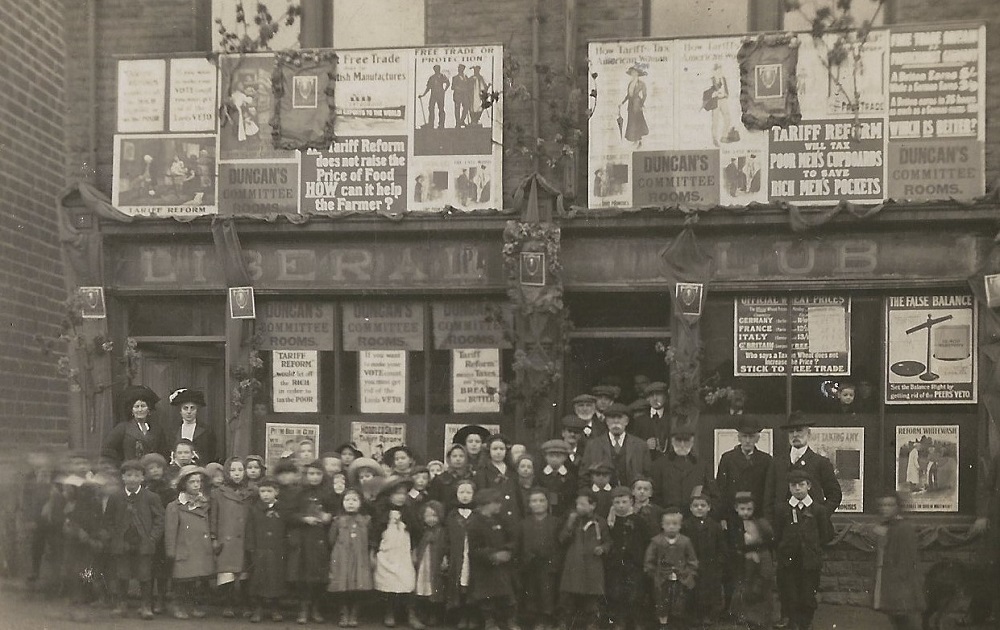
There were two elections in 1910, in January and December. There were probably more posters in these elections than any before or since. During the January election alone posters covered over two million square feet of wall space in London.
Poster designers drew on a rich language of symbols to translate arguments into pictures. Voters were often depicted as children, perhaps to suggest their vulnerability. A loaf of bread symbolised free trade. The shopping basket represented the price of household goods. Top hats were the sign of wealth or privilege. Each of these two posters contain one or all of these symbols.
During the Edwardian period, the worlds of political cartoons and posters often overlapped, with the same artists working across newspapers, commercial advertising, and party campaigns.
Francis Carruthers Gould, a Liberal supporter, produced cartoons for the Westminster Gazette that were turned into posters for the Liberal Party (UK) in the 1906 United Kingdom general election. Illustrator John Hassall, known for commercial posters for brands like Colman's and Kodak, also designed campaign posters for the Conservative Party (UK). Similarly, Gerald Spencer Pryse created posters for the Labour Party. All believed that powerful images could communicate political ideas more effectively than words.
Image courtesy of the Aireborough Historical Society
John Hassall, famous for advertising and cartoons, turns his hand to political posters.
Milk Snatcher
Class, Cash, and the Message
Hooked
Gerald Spencer Pryse's appeal to mothers. Women could vote for the first time in the 1918 General Election.
New voters
The 1928 Equal Franchise Act didn’t just shift politics it changed the dynamic. Women had the same voting power as men, and political parties had a brand-new audience to win over. Cue the poster era: bold graphics, punchy slogans, and a visual language designed to speak directly to a younger, newly empowered female electorate.
But while the audience changed, the messaging didn’t keep up. A lot of these posters leaned into traditional gender roles, casting women as homemakers, caregivers, the backbone of domestic life.
There were, however, flashes of something different. Some designs tapped into the reality that millions of women worked. For a moment, the visuals hinted at a more progressive narrative, one acknowledging women beyond the home.
It didn’t last. Post–World War II, despite women continuing to make up a huge part of the workforce, political imagery snapped back to old-school stereotypes. The working woman faded from the frame, replaced again by the familiar domestic iconography.
Rather than reflecting women as they were, these posters often projected what parties wanted them to be. They assumed women would vote along the lines of family roles rather than as individuals with independent economic and political identities.
Parties for all?
Hold your gaze
Labour leader James Ramsay MacDonald appeals to new voters in the 1929 election.
An appeal to shoppers, this elegantly dressed women was the very image of modernity in 1929.
Presidential Politics
The UK assume that presidential-style politics is American. However, throughout the 20th century certain elections have thrown the leader about the party. In 1997 it was Tony Blair and David Cameron in 2010. Most recently Reform has built its brand around Nigel Farage.
Personalisation has been running since the 1920s. Posters provided commanding visuals of party leaders designed to cut through and connect. While hard to create meaning or indentity around a party it was much easier in a leader.
Leaders were framed as upright, composed, peak statesman. Over time, that look softened. As British politics loosened up, so did the visuals. The stiff portraits gave way to something more relatable, more human, more camera-ready.
Safety First
Tony Blair and the Politics of Cool
Air Brushed Cameron
General Manager Wanted
Symbolism when pictures do the talking
We immediately recognise brand logos such as Nike and Apple because they have become shorthand for the values of those companies. Political posters have also long used symbols to communicate powerful messages. The sun represents hope and new beginnings, making it a natural metaphor for elections that promise a brighter future; the shopping basket represents the cost of living; and even the pipe became a visual representation of a Prime Minister’s reliability and thoughtfulness. The use of such symbols is a reminder that posters are a form of advertising, designed to persuade people who may only see them briefly in passing.
“Sun-Ray” treatment
Politics, But Make It Fashion
This is not a pipe... It's a Prime Minister
Hope, Sunrise, Repeat
1950-1979: Selling Politics Like Soap Powder.
By the 1950s, the visual language of political posters had
shifted. The era of hand-drawn work by cartoonists and illustrators was fading
out, replaced by a cleaner, sharper graphic style.
Working with professional advertising agencies like Colman,
Prentis & Varley, parties brought national strategies. A polished approach focused
on presenting the positives rather than going on the attack. The emphasis moved
away from detailed policy argument and towards selling a clear, compelling
vision of the future.
A recognisable formula emerged: a bold central image paired with a tight, memorable line. Photography became the norm rather than the exception. The result was a streamlined aesthetic. Posters designed to land quickly, communicate a feeling as much as a message, and stay with you long after a passing glance.
From Policy to Promise
Less Noise, More Impact
From Streets to Screens
After 1979: Labour Isn’t Working and its Aftermath
Since 1979 the media has judged all posters against the Conservatives’ example Labour Isn’t Working. During the 1980s and 1990s the advertising agency Saatchi and Saatchi produced several high impact designs for the party.
These included Labour’s Double Whammy and Labour’s Tax Bombshell. Labour also developed greater skill in political advertising during this period.
Just as technology was becoming more advanced, the traditional satirical attacking poster had a renaissance.
The Poster That Defined a Moment
Red Wedge poster from 1987
A Bombshell from 1992
The Double Whammy
Behind the Sofa
The Price of Learning
When the medium became the message